Designing a Unified Billing & Pricing Portal
Turning messy email-thread discounting into an automated quoting and approval system for Sales Associates, Pricing Admins and Business Owners.
- Role
- Sole Product Designer
- Scope
- Research → Handoff
- Roles designed
- 3 distinct views
- Rule shipped
- 10% discount gate
Outcome & what I did first
I owned the product end to end
When I joined, peopleHum's sales team had no platform to create price quotes or get discount approvals — everything lived in long email threads and chat messages. I took the project from stakeholder interviews and requirement gathering through process flows, wireframes, high-fidelity UI and developer handoff.
The problem was simple: custom price deals were messy, slow and untracked. The Billing & Pricing Portal automated pricing, custom discounts and approvals across three roles.
One portal replacing an inbox full of approvals.
No more deal-desk delays
Any quote over a 10% discount auto-flags for approval; standard quotes go straight out.
Clean role views
Associate, Admin and Owner each see only the data they need to decide.
Full transparency
Proposal history, pending approvals, client ARR and per-employee pricing in one place.
The core problem
Custom pricing was a manual, risky guess
Quoting a client across the USA, India, UK or Canada meant hand-calculating headcount, implementation fees, quarterly vs. yearly contracts and module mixes like Hire, Engage and Feedback — then emailing someone for sign-off.
- Sales deals took far too long to get approved.
- Finance admins couldn't track how discounts were given.
- Real risk of unapproved, huge discounts to enterprise clients like Volkswagen.
Requirement gathering
A team of one, talking to everyone
Sales Associates
An easy calculator to pick modules, adjust prices and instantly know if a discount needs higher approval.
Pricing Admins
A clean list of incoming requests with full context — headcount, location, contract value — so no chasing emails.
Business Owners
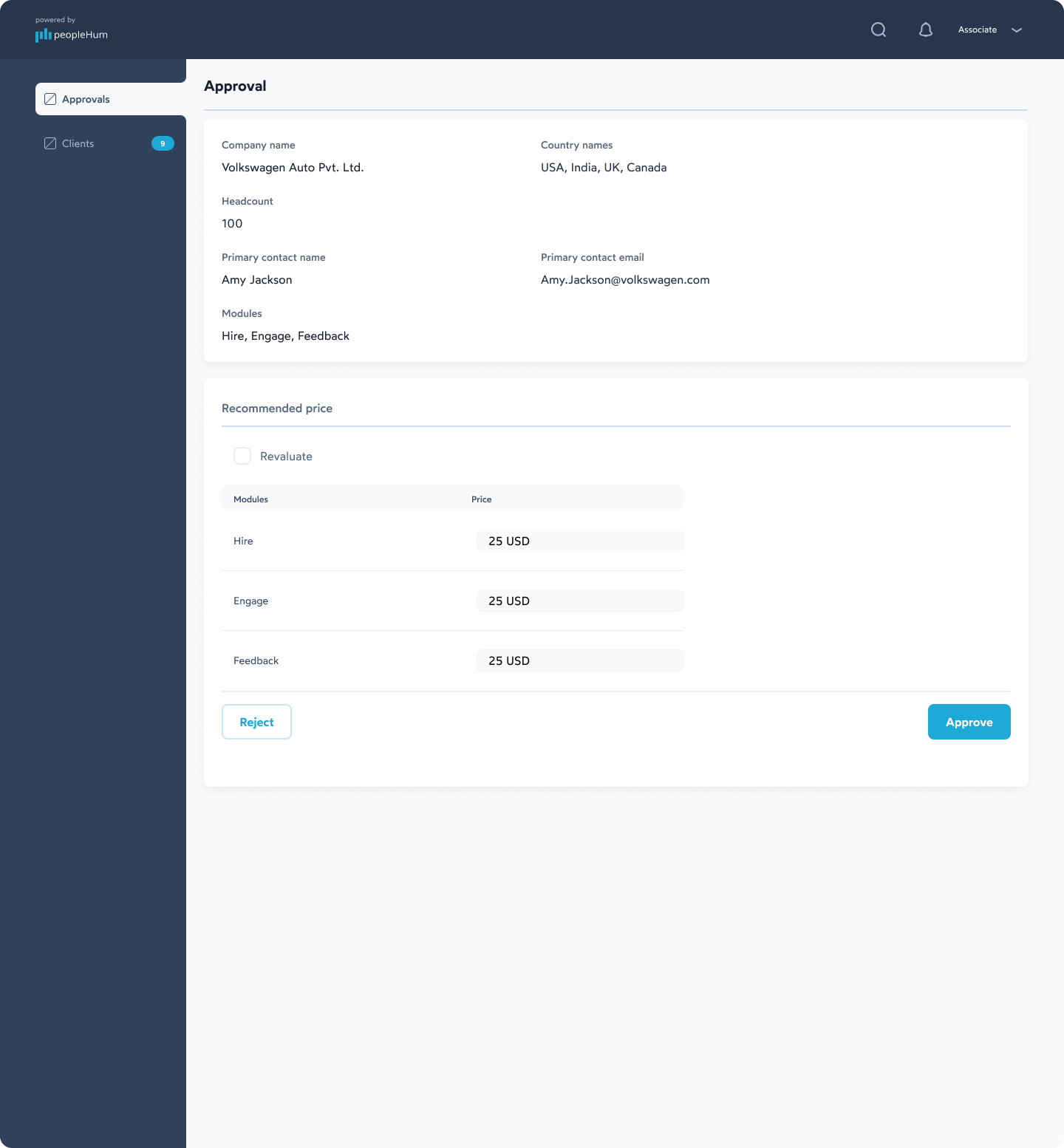
A quick summary screen to review custom discounts and Approve or Reject in one tap.
Mapping the flows
Before Figma, I mapped process flows and sitemaps, defining when a quote passes automatically versus when it gets flagged.
UI/UX design
Three roles, three tailored views
Enterprise tools carry a lot of data without feeling cluttered. I organised the product around three hubs — Price Quotation, Requests / Approvals and Clients — then tailored what each role sees.
Sales Associate view
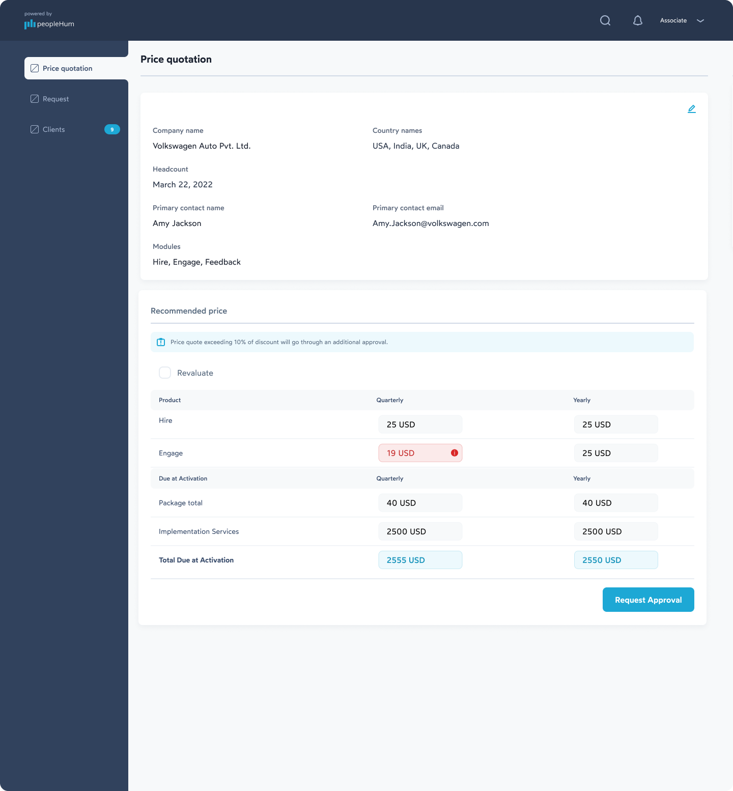
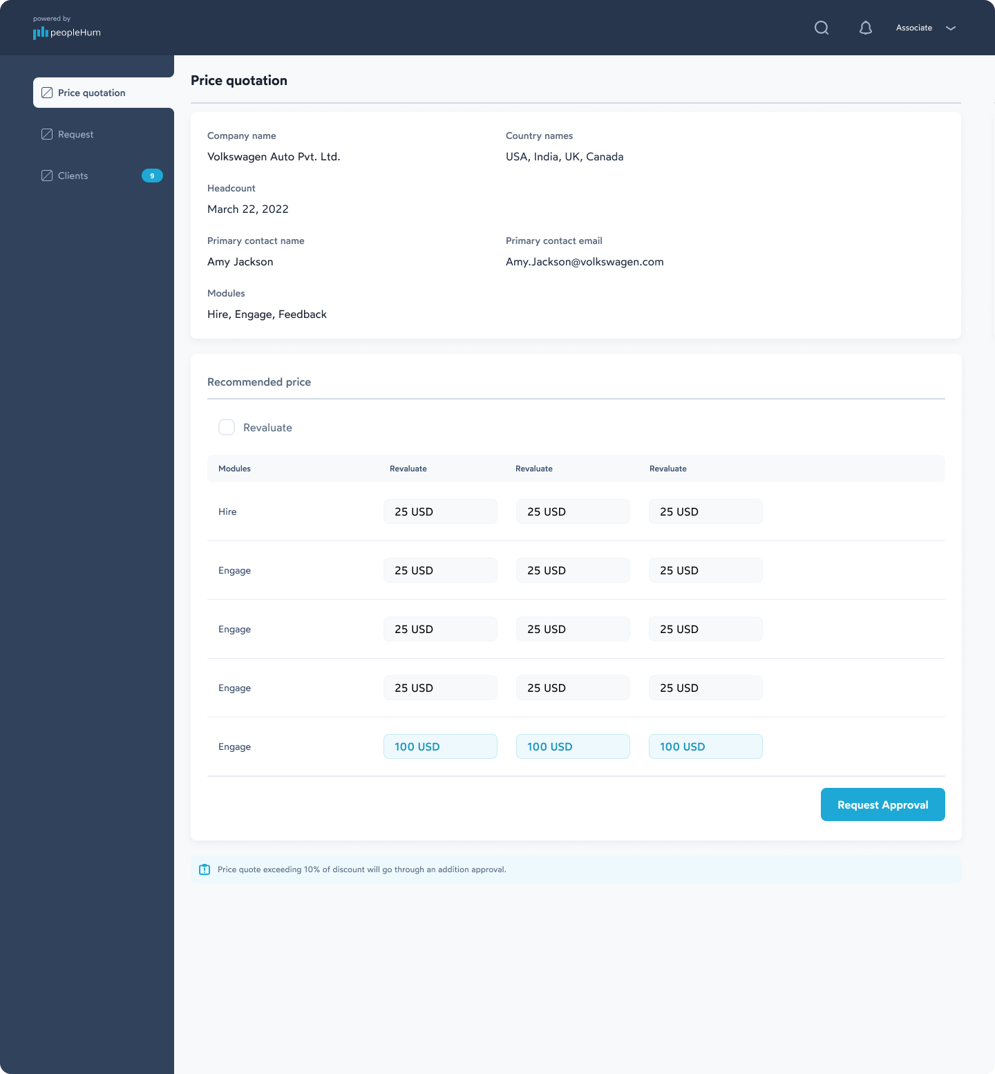
Price builder. Enter client details, headcount and countries, then set module prices for quarterly or yearly plans.
Smart warning alert. Drop Engage from 25 USD to 19 USD and a banner appears: exceeding 10% discount requires additional approval.
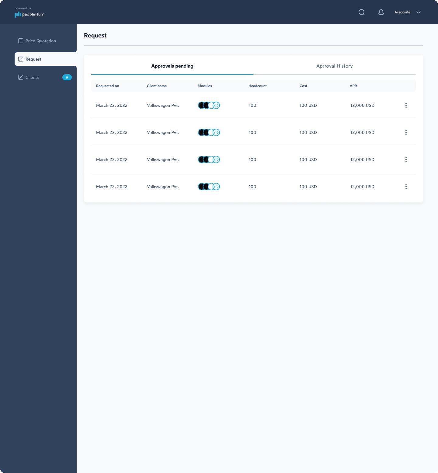
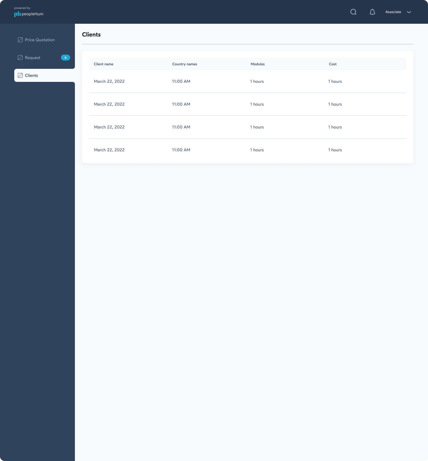
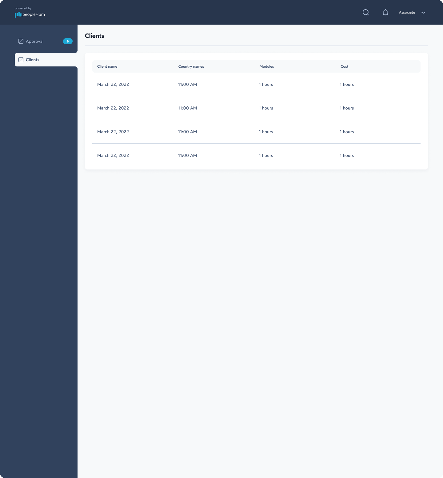
Status & client list. A clean tab for pending approvals and past client proposals.
Pricing Admin view
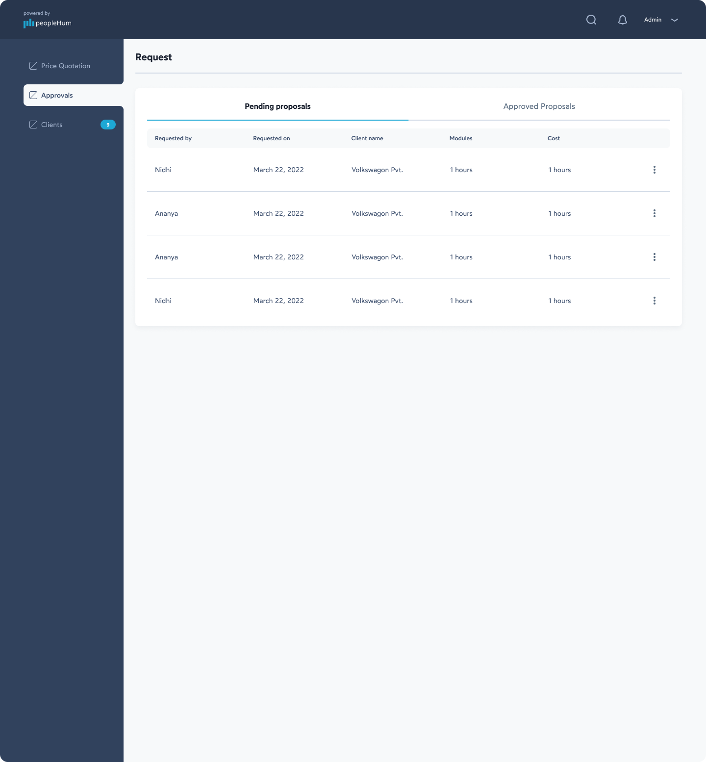
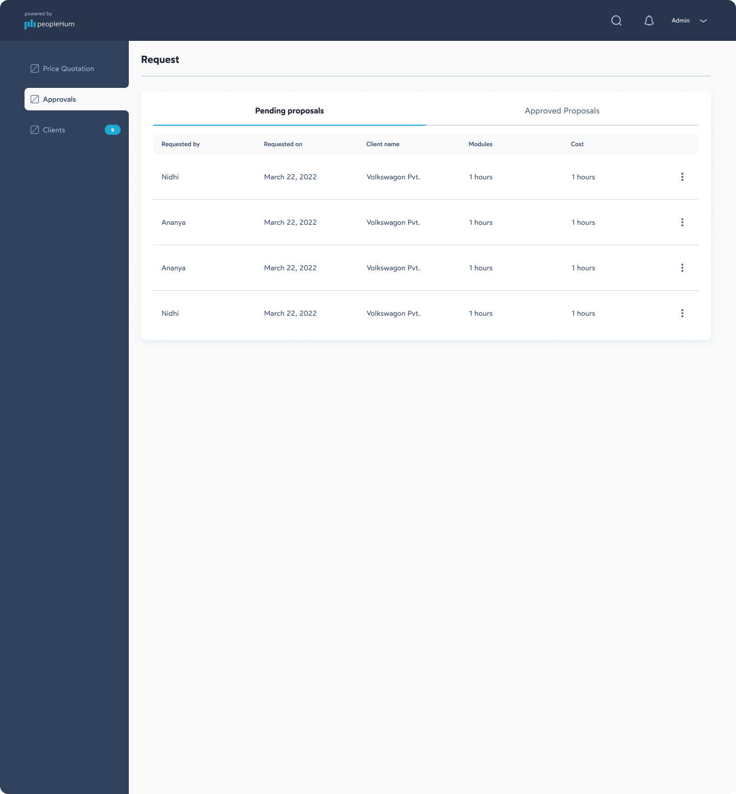
Central approval list. Every pending quote submitted by team members in one simple table.
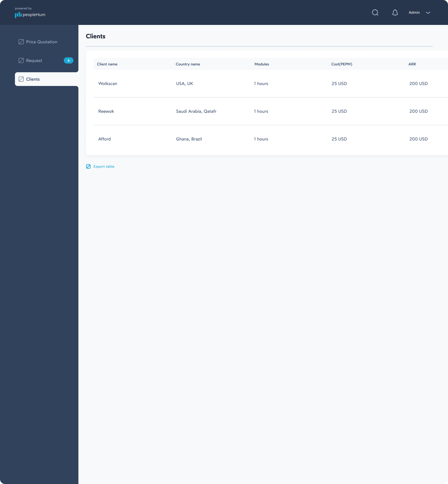
Financial overview. Cost per employee (PEPM), total contract cost and total ARR right in the client table.
Price breakdown. Normal rates versus requested discounted rates, side by side.
Business Owner view
Executive summary. High-level client and pricing details, nothing more.
One-click decisions. Clear Approve and Reject buttons so leadership decides in seconds.

Visual & graphic design
Part of the peopleHum ecosystem
Clear typography
Clean sans-serif with distinct sizes so headers, labels and numbers separate naturally.
Total ARR
$88,200
Colour usage
Deep slate for navigation, bright blue for actions, soft red for discount warnings.
Data tables
Aligned columns, generous spacing and subtle badges so numbers scan fast.
Screen library
All screens
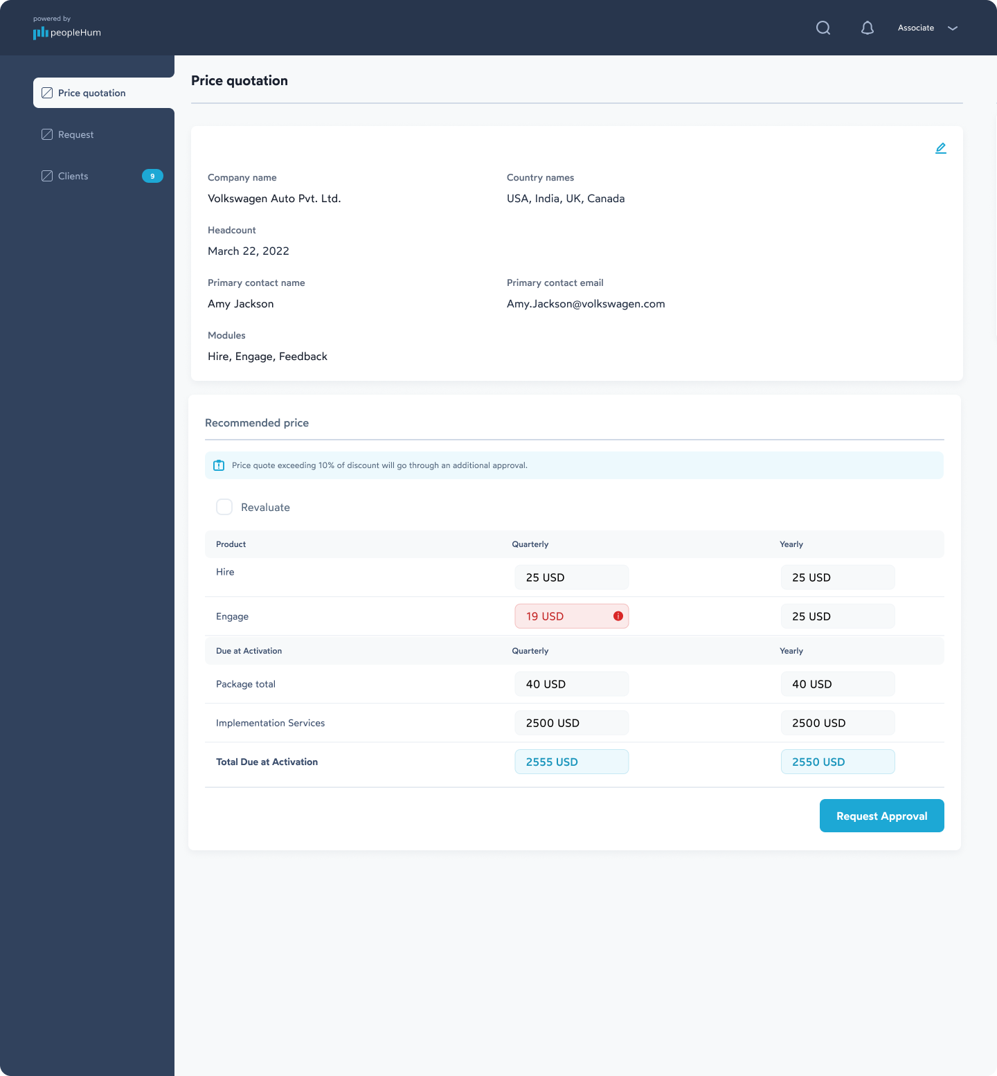
A complete, upfront view of every screen in the portal. Each card is scrollable, so you can still inspect the full layout inside any frame.
Collaborating & iterating
Design as an ongoing conversation
Syncing with engineers
Walked frontend devs through component states — hover, active, disabled, warning — and checked dynamic inputs were feasible.
Product management checks
Handled edge cases with PMs, like how multi-country deals appear in the database without messy formatting.
User feedback
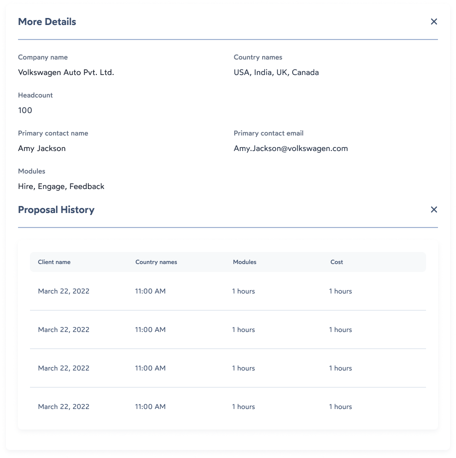
Associates wanted past proposals while quoting, so I added an inline Proposal History section into the workspace.
UX troubleshooting
Too many table columns
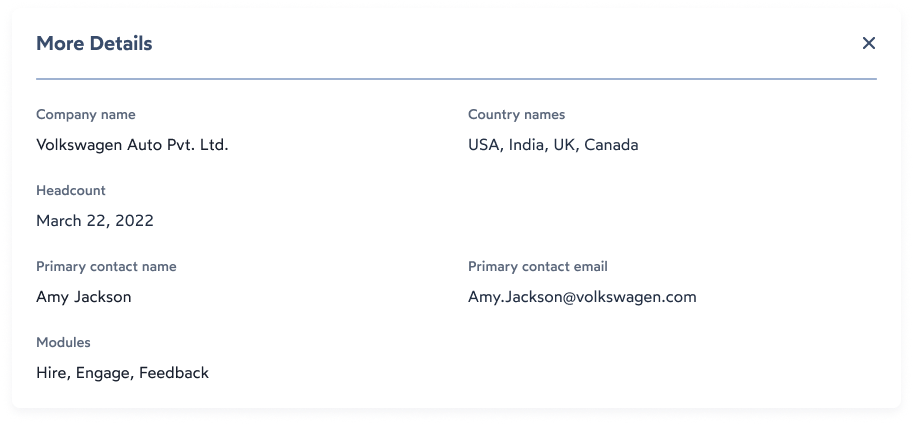
The client table forced horizontal scrolling. I kept only the key numbers in the main table and moved secondary contact details into a “More Details” popup.
Warning notice placement
The discount banner sat near the submit button and got missed. I moved it directly above the pricing table so it appears the moment a discounted number is typed.
Role navigation confusion
Switching between admin and associate test accounts was confusing, so tab names in the left nav now change dynamically with role permissions.
Outcome & what I learned
Order in a chaotic sales process
Faster deal approvals
Standard quotes go out fast; custom deals route to admins automatically.
Better operational control
Clear audit trails for finance and execs, protecting company margins.
Consistent UI system
A scalable design system that matches the rest of the peopleHum platform.
Being the sole product designer taught me how to turn complex financial business logic into simple, human-friendly screens. Talking to SMEs early saved months later — and with heavy numbers, visual clarity, instant inline feedback and clean hierarchy make all the difference.